Making a homepage say what the business does.
Usability testing the DCM homepage to find where first time visitors got stuck, then fixing the highest impact issues with the design team.
3Participants
5Task scenarios
7Themes
6Homepage fixes
Usability testing the DCM homepage to find where first time visitors got stuck, then fixing the highest impact issues with the design team.
A site that worked, once you knew where to go.
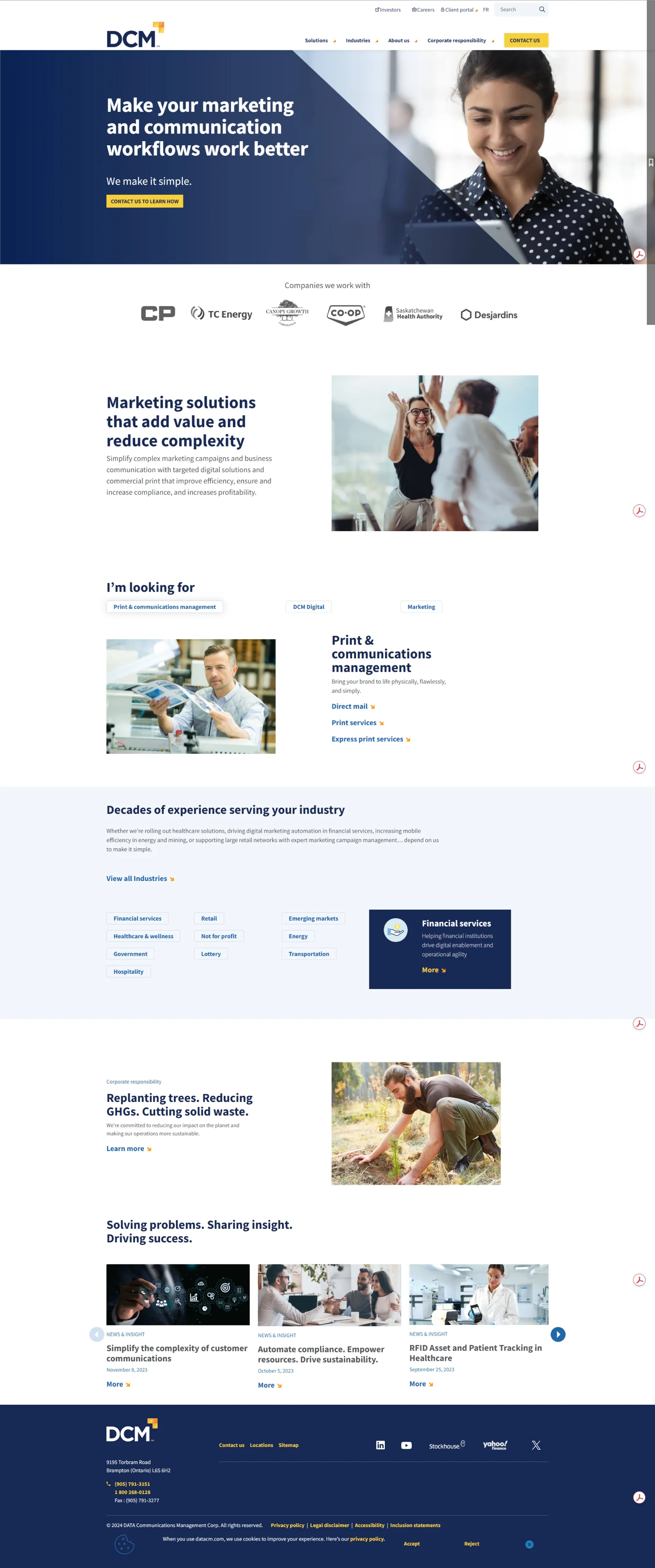
DCM is a digital content management company. Their website needed to communicate services, guide users, and make it easy to get in touch. Nobody had tested whether it actually did.
They brought me on as a UX researcher to find out where users were getting stuck, and to work with the design team to fix the highest impact issues inside a three month window. The brief was the homepage: does a first time visitor understand what DCM offers, and can they act on it?
This study ran before generative AI was part of my workflow.No transcript was summarized by a tool and no data was passed through a model. Every session note, every sticky, every cluster and every priority call was written, sorted and shared with the team.
Three participants, one live site.
I wrote five task scenarios that mimic how a real potential client would explore the site: working out what DCM offers, finding proof it fits their business, and getting in touch. Each participant worked through them out loud.
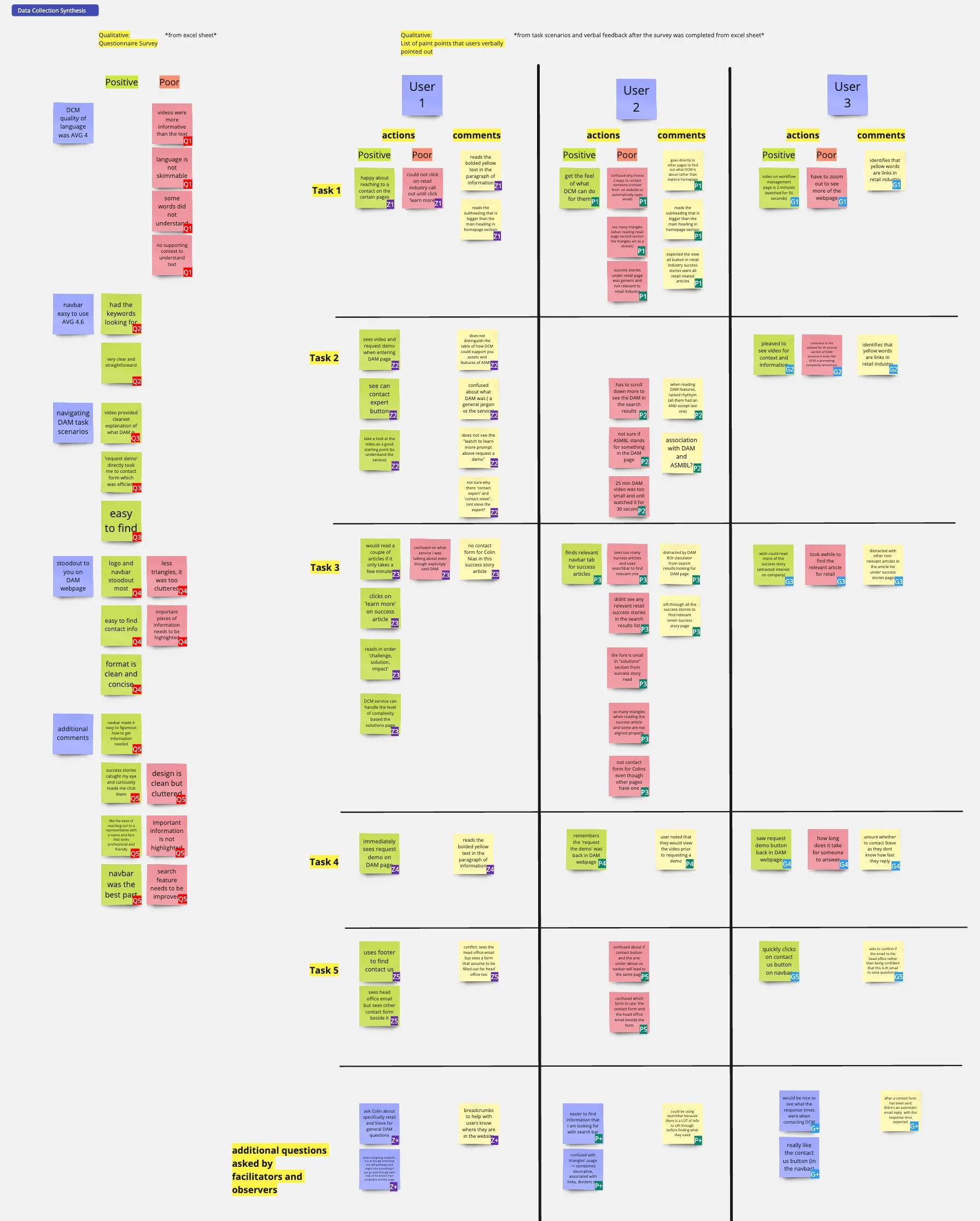
I captured each session in two passes: the questionnaire responses on the left, and everything participants said out loud during the tasks on the right, split per user and per task into actions and comments. Green for positive, pink for friction, yellow for observations from the facilitators.
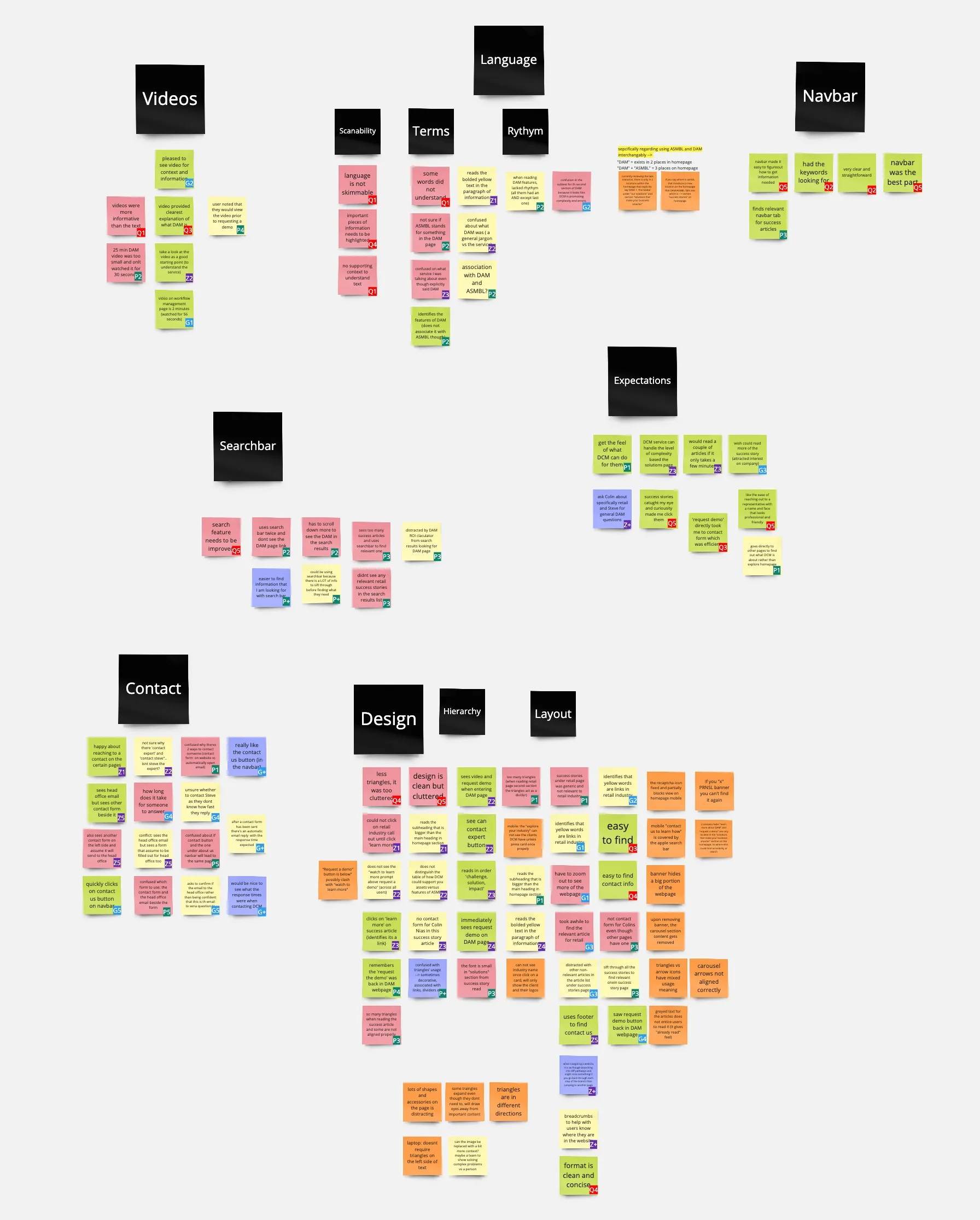
Then I pulled every note out of its per task home and reclustered them across all three participants, with the team. The black headers are the themes that came out of it: seven patterns, each one backed by notes from more than one session.
4 signals, consistent across all three sessions
Found the button and landed on the form in under a minute. No confusion, no wrong turns.
The quickest task in every session. The head office email lived where users expected it.
The one area with universal positive alignment. It consistently got users to the right section.
A minute of video explained DAM better than any page of text we put in front of them.
4 signals, all inside the exploration tasks
Industry info, DAM, and success stories all dragged. The longest task in the study lived here.
Wrong turns, backtracking, repeat. Users rarely reached an exploration page on the first try.
Used multiple times, surfaced almost nothing relevant to what users were actually after.
Nobody could say what DCM does, or how its services relate, from the homepage alone.
Once users knew where to go, the site worked well.The problem was getting them there. Every piece of friction sat in the tasks that simulate a first time visitor.
Seven patterns, not seven opinions.
Six homepage fixes, scoped to three months.
I presented the findings to my team and we ran a collaborative session, splitting everything into homepage and other work. With three months, scope was the whole decision.
Remove the vertical ones entirely. Standardize the rest: one direction, no animation, no resemblance to clickable elements.
Categories, better keyword matching, suggestions as you type, and industry filters for success stories.
Lead with DAM, the term users already know, and build the ASMBL name through hierarchy and contextual copy.
Remove “Contact Expert.” Cut the redundant dropdown. Clarify which form goes where. Add response time expectations.
Proper H1 and H2 per AODA standards. Subheadings smaller than headings. Fewer competing font sizes.
Bigger embeds, visible run times, chapters on the long ones, and the CTA moved next to the player.
Before and after, on the same screen.
Three of the changes that shipped, each one shown against the problem it was solving. Switch between the two states to compare.
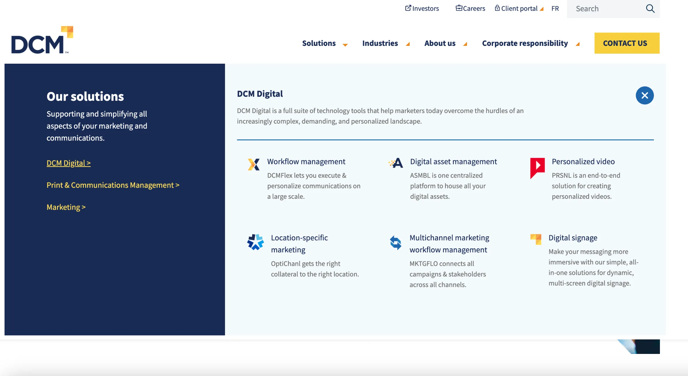
The dropdown listed service names only, and the general terms behind them were used interchangeably here but separately everywhere else on the site. Users could not tell which service was which, or whether two labels meant the same thing.
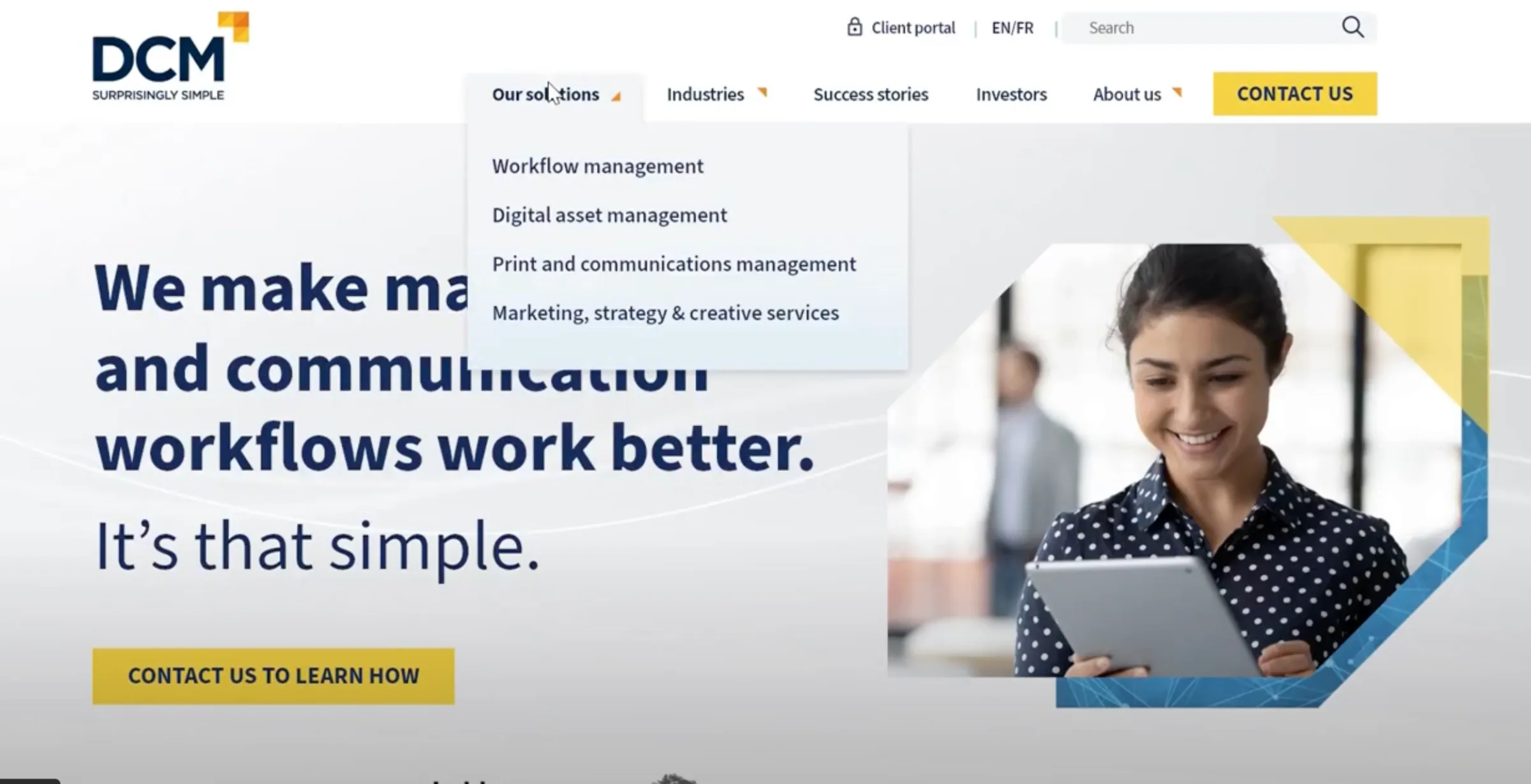
Every solution now carries one line of plain description in the menu itself, grouped under the category it belongs to. Users can tell the services apart before they commit to a click.
Decorative triangles faced in different directions across the page and backdrops, a strong brand presence that left the user out. Some of them read as links, some as cursors.
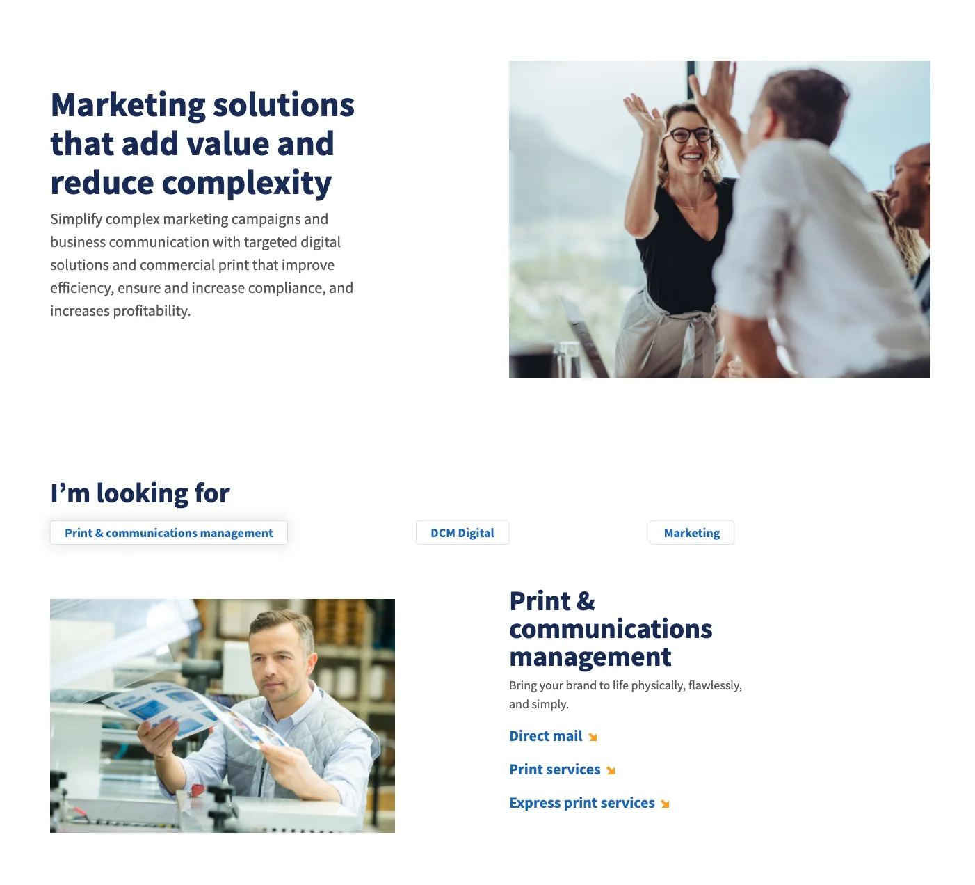
The subheadings were set larger than the headings above them, so users read the sections in the wrong order without noticing.
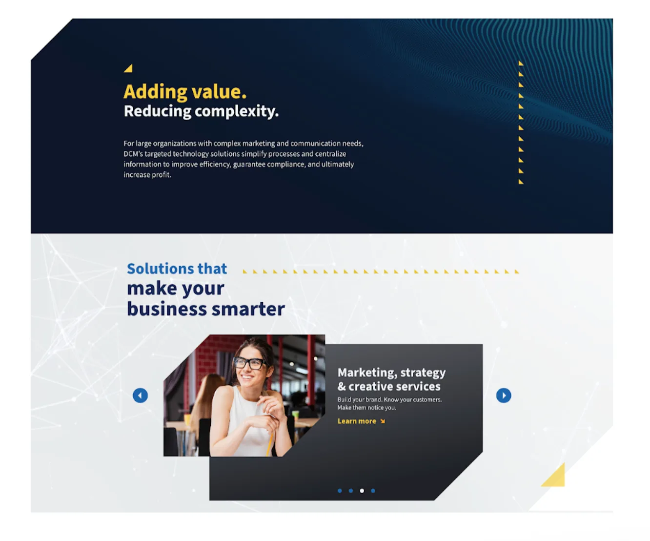
Headings now step down in size, largest first, so the page can be scanned in the order it was written. The triangles are gone from the layout, leaving the content to carry the page.
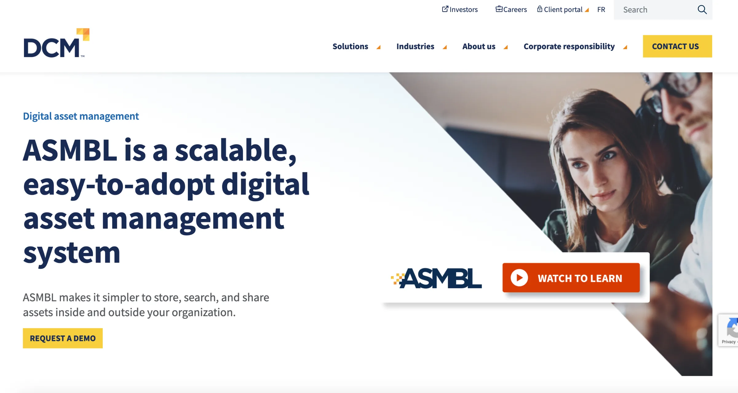
“Watch to learn more” sat at the bottom of the left column, a full screen width away from the player it controlled. Nobody in the study clicked it.
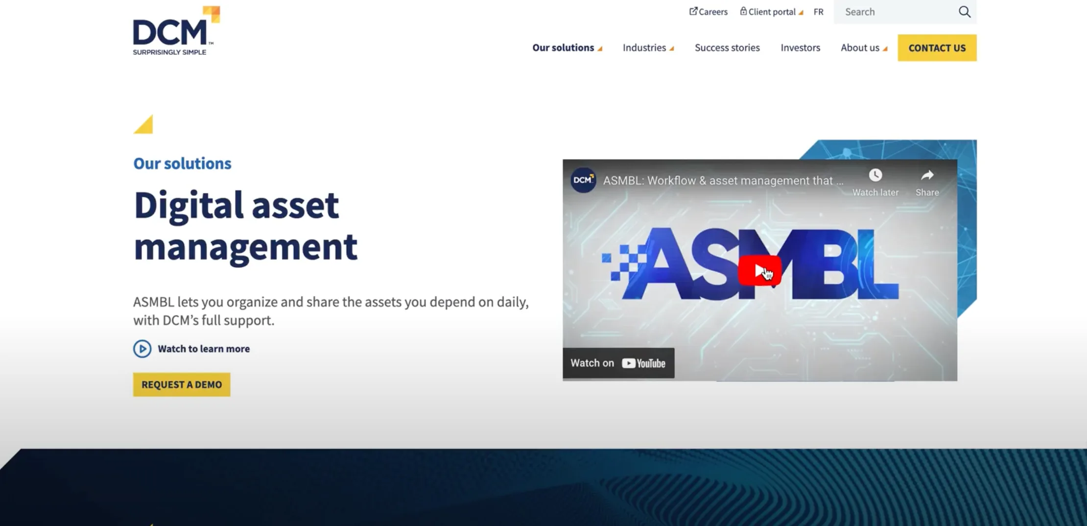
The watch link now sits on the right, directly on the video it plays, so the label and the thing it does share the same place on the page.
If I’d only used the survey I would have missed most of the real problems. High scores masked friction that only showed up in behaviour.
The same themes came up in all three sessions. Triangles, search, DAM and ASMBL were not edge cases, they were patterns I could act on with confidence.
Splitting the homepage from everything else and running a priority matrix is why this ended as shipped changes, not a PDF in a shared drive.