GA4, Hotjar, Google Tag Manager, Formidable, Calendly
People were arriving, but not understanding enough to act.
CADworks3D makes high resolution 3D printers and resins for microfluidics, the tiny channel devices research labs use for cell biology, diagnostics and chemistry.
We set out to build a more reputable website, one that explains what we do and what we sell in a more descriptive and informative way, so that visitors understand the products well enough to get in touch. That meant first finding out what on the old site was working and what wasn’t.
78%of visitors never stayed engaged for ten seconds
1.5pages seen per visit, by visitors who were nearly all new
cadworks3d.com
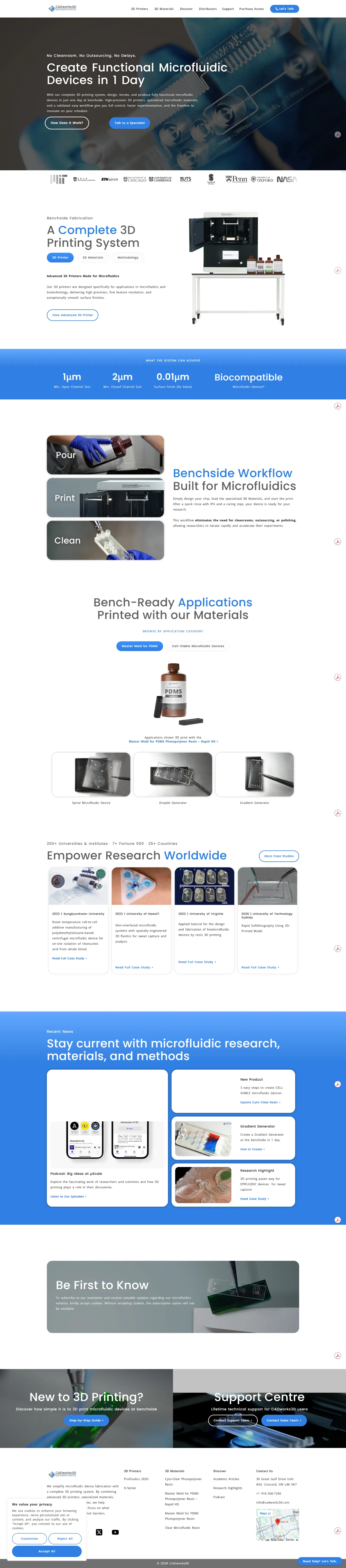
The redesigned homepage. Scroll inside the window to see the full page.
02
What the team believed, and what the data said
Two of the three beliefs were reframed by the data.
Before the research, I set up Hotjar and Google Analytics 4. Our team reviewed the heatmaps together and agreed on what the homepage, and the site, needed to do for visitors. That gave us three working beliefs, and I tested each one against the data.
“Visitors aren’t motivated to act.”
Readers didn’t act, but the easiest action was hard to find and the others asked too much. A path problem, not a motivation problem.
Reframed
“Visitors need simpler information.”
They did misunderstand the product, yet the most technical section was the most read. They needed the category explained first, with the depth kept below it.
Reframed
“Unclear hierarchy hides content.”
Confirmed for the homepage, and the content itself wasn’t the issue. The same product was read twice as deeply on one page template as another.
Confirmed
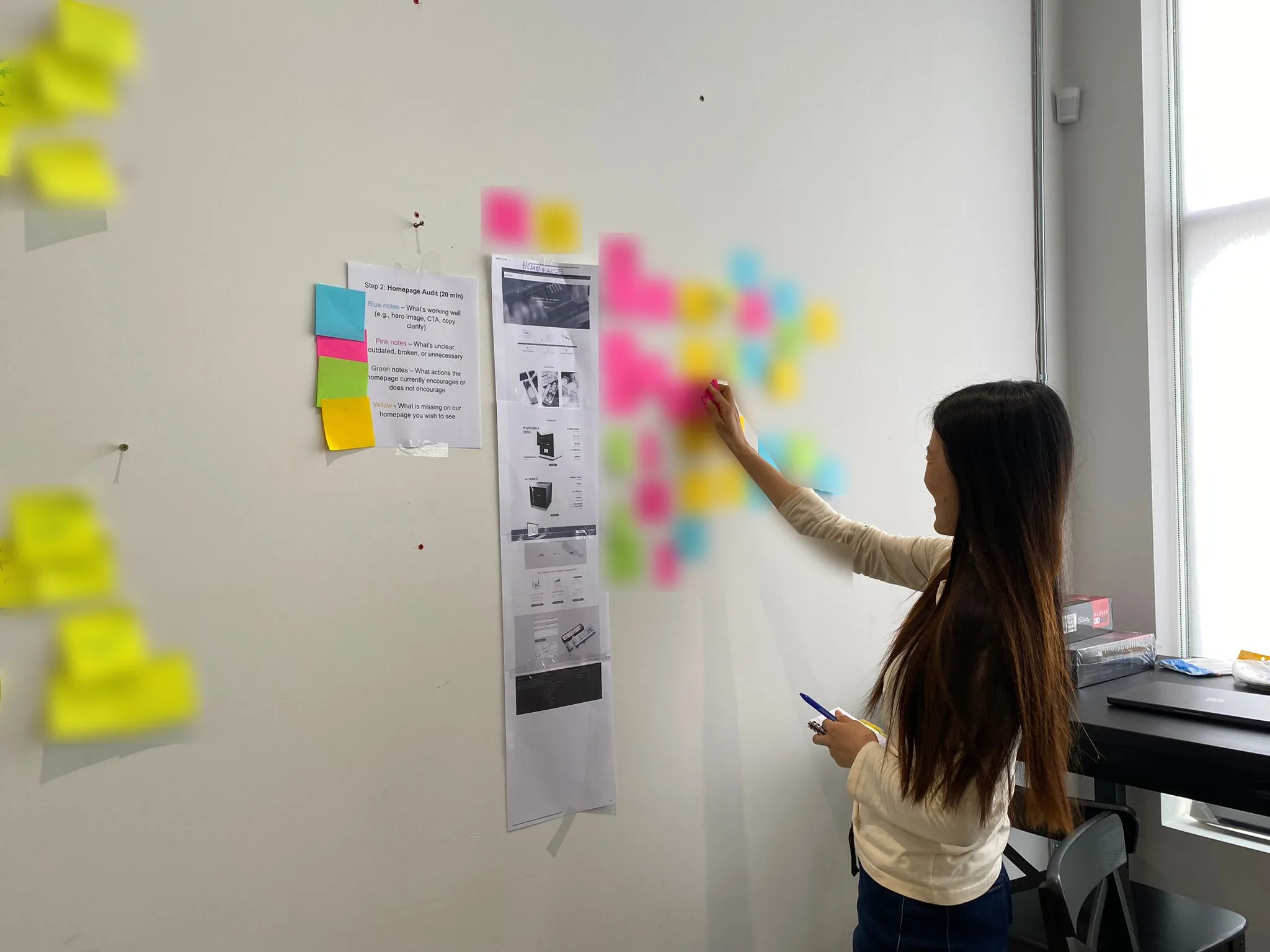
The webpage review as a team, where our beliefs stemmed from.
03
How I researched it
Seven independent sources, both numbers and words.
Mixed methods triangulation. Nothing was collected specially for the study. I reanalysed data the business already held, both numbers and words, and compared it across seven independent sources.
What people did
Web analytics and heatmaps.
What people said
Four years of quote form responses, two observed sales calls, and an interview with our sales team.
Who they were
Roles from call bookings and from a self serve interest form.
04
What I found
What researchers needed already existed. It sat where people didn’t reach.
1
Trying it first mattered most, and was buried.
The free sample was the most effective page on the site, yet about 2% of traffic ever reached it.
“That’s great to have a sample box to test it.”
A principal investigator
2
People couldn’t tell which product fit them.
Very few visitors landing on the printer overview went on to a printer page, and the comparison table made the cheaper printer look sharper than the flagship.
“What is a DLP printer?”
A principal investigator writing a grant
3
Proof drove discovery, but sat behind a carousel.
Visitors arriving from conferences and published research engaged most, yet institutional proof reached about 1 homepage visitor in 10.
4
The first screen lost half of visitors
before explaining what the product was.
5
Placement, not content, decided what got read.
The same two resin products were read to the end twice as often on one template as on another.
05
Who we designed for
The Funded Newcomer
Budget holder, new to 3D printing, naming an instrument in a grant. Needs the category explained first.
The Bench Evaluator
Student or postdoc doing the technical assessment, often finding us through published papers. Needs evidence and something to try.
The Frustrated Switcher
Budget holder who has outgrown their current printer. Needs proof their specific problem is solved.
The Method Switcher
Expert in a different fabrication method, deciding whether to change method altogether.
The buyer is usually two people.Budget holders tended to book a call, while evaluators tended to use the self serve form. They use different doors in the same visit, so both doors need to be visible from every page.
06
What we changed
I turned the findings into design decisions with the team.
Scarlett led the visual layout of the new pages from the research, while I rebuilt the platform underneath them: upgrading the server from outdated software, restructuring the URLs and optimising images. The homepage became about 60% lighter and its performance score improved by about 80%. I also added custom tracking to a site that previously had none.
01
One strong template per material.
Every resin moved onto the template that was read twice as deeply, with technical features and real dimensions high on the page, and the duplicate catalog pages were retired.
02
A printer overview that helps people choose.
Request a Quote became the primary button, a helper bar offers guidance on choosing, and the comparison link says exactly what it compares.
03
Carousels unrolled on the flagship printer page
so its key differentiators are always visible rather than one slide in five.
04
Proof moved up.
Institution logos now sit just below the homepage fold, and a new Discover section gathers research and case studies.
05
A homepage hero that leads with our value proposition
saying in plain terms what we do and how we differ from other microfluidics businesses, instead of naming a category.
06
One route to the sales team.
A rebuilt contact page, with Talk to a Specialist in the heroes of the main pages.
07
The free sample, moved up the page.
The old pages offered it only at the very end. It now sits much higher on the resin pages, because the sample shows what the printer and resin produce together.
07
What worked, and what didn’t
A result only counts here when web analytics and heatmaps agree.
The nine months after the redesign compared with the same nine months before it.
What worked
The printer overview became the best page on the site. It has the lowest exit rate, about a third of its visitors move on to another page, and heatmaps show time on the page rising 60% over the year.
The unrolled flagship content is now the most engaged section of that page in every quarter.
The template decision paid off. The reading gap between the two resin templates halved, and the retired catalog pages lost about 80% of their traffic to the better pages.
Desktop visitors stay engaged 18% longer, and the URL restructure cost nothing in search, because pages whose URLs moved lost search traffic at the same rate as pages that didn’t.
Share of page views that read to the end
Whole site
16% before
32% after
Contact page
10%
40%
Case studies
20%
37%
Clear resin
23%
39%
Master mold resin
25%
36%
Homepage
11%
15%
Reading to the end means scrolling at least 90% of the way down. It depends on page length, so it is read alongside time and exit data rather than on its own.
What didn’t work, and what’s next
Not yet built
Moving between pages
Still about one and a half pages per visit, 92% of visitors never click an internal link, and the navigation draws more clicks than Request a Quote on the flagship page.
In progress
The free sample
Research on the free sample is in the works.
Didn’t work
The homepage
The new hero shipped, but the homepage improved least of any page and its time on page fell over the year.
08
What I learned
01
Data stretched over this long has a lot of nuance.
Marketing campaigns and visitors arriving from many different parts of the internet all shift the numbers, so I had to stay mindful that none of it was skewing the data.
02
Track what gets built against the research.
Keeping a shared record of what shipped, aligned with the research findings, kept the whole team working toward the same goals.