Hospital wayfinding a child can follow.
Let children find their own way through a hospital without asking an adult, and make the walk feel like an adventure.
6 to 12Age range
2Observation sessions
4Products compared
2Prototype rounds
Let children find their own way through a hospital without asking an adult, and make the walk feel like an adventure.
A child who cannot read the building has to be led through it. Bobo gives them something to follow that is theirs.
The wayfinding system ends a few metres past the entrance.
Coloured footprints lead away from the front doors and stop before the first junction. Past the lobby every corridor looks the same. Yellow lighting, identical doors, signage written for adults, and nothing that tells a child where they are or which way to turn.
Children almost never navigate on their own. They hold a hand, walk behind a parent, or look at the floor. The one place a child was independent for any length of time was a screen game built into a waiting room wall.


Two afternoons of structured observation.
I ran unobtrusive observation sessions in three zones: the entrance, the Clinic 9 waiting room and the connecting hallways. Notes were timestamped and taken in public areas only. I logged who each child moved with, what held their attention, and any moment they acted independently.
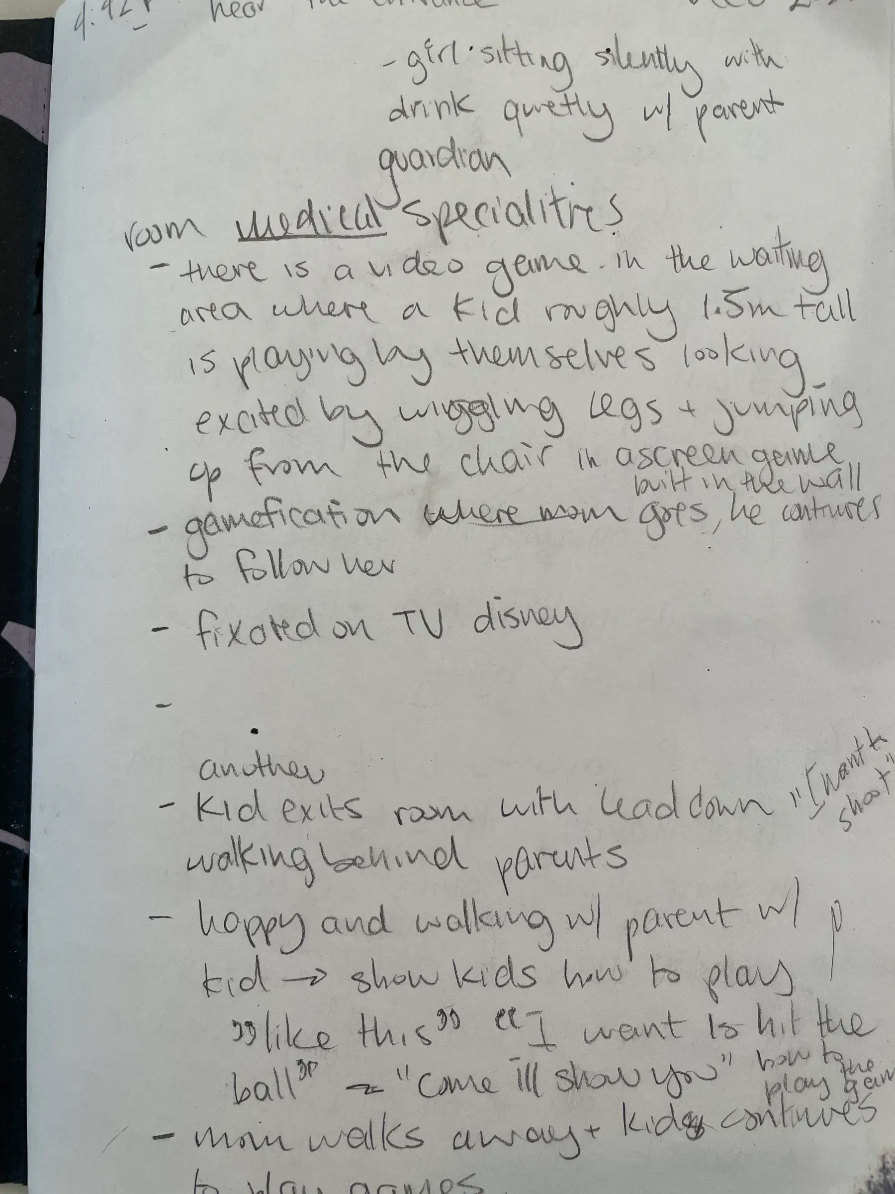
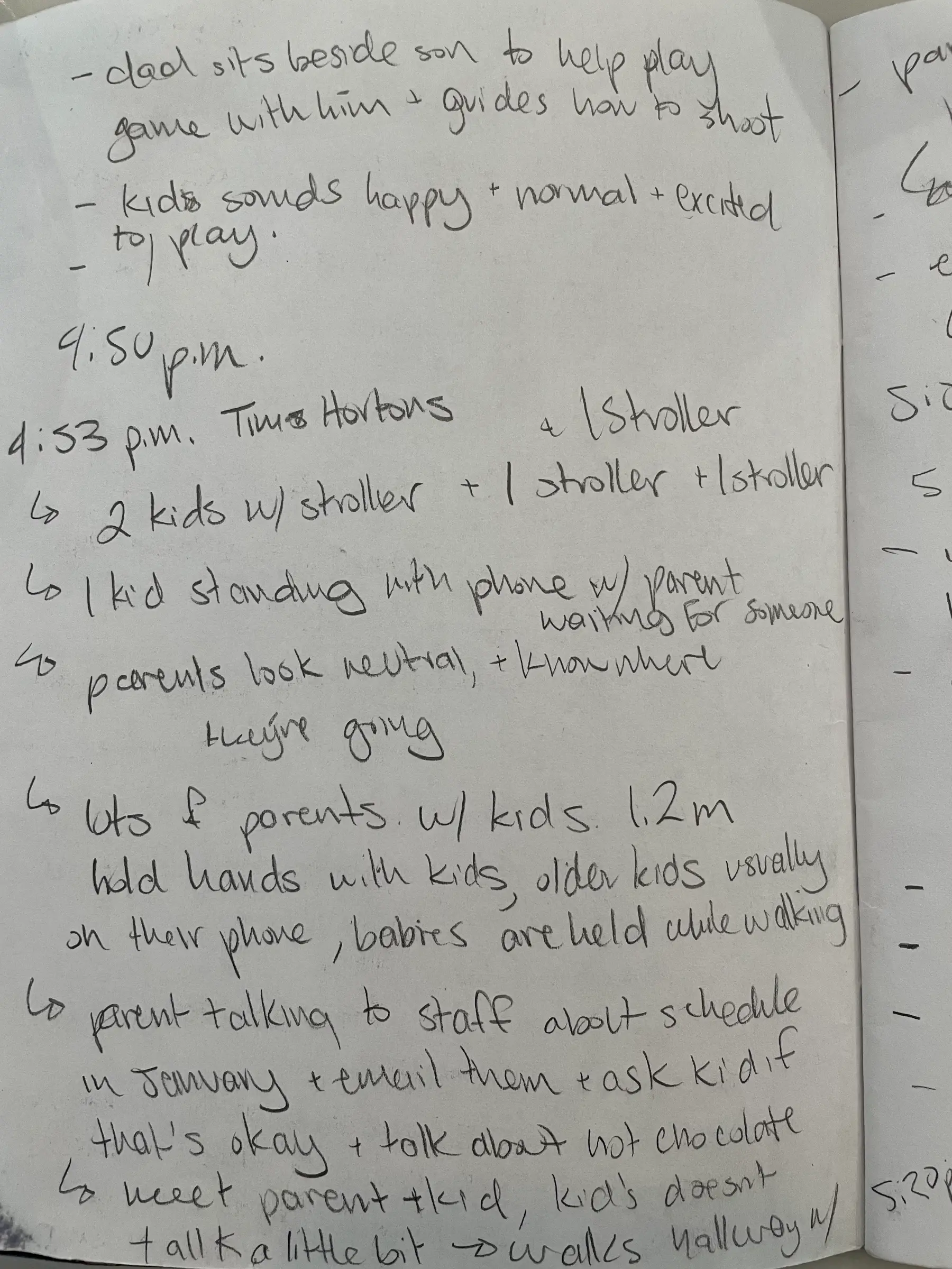
One child took the lead only once in two afternoons, in front of a screen, and the first thing he did was bring his parents over to see it. That is the behaviour the building already produces: a child will lead when something is theirs to hold.
So the guide should belong to the child rather than be read out to them by an adult.
Built for adults, or built for play. Not both.
I compared Bobo against the two things an average child aged 6 to 12 would otherwise have on a hospital visit: the building’s own static signage, and the apps that exist today. ARWay is a general indoor AR wayfinding platform aimed at adult visitors; Alder Play is a children’s hospital companion app built for comfort and distraction rather than navigation.
The criteria come from what the observation turned up.
| Criterion | Bobo the robo | Hospital signage | ARWay | Alder Play |
|---|---|---|---|---|
| A child can use it without an adult reading for them | Intended | No | No | Yes |
| Routes you to a destination inside the building | Yes | Partly | Yes | No |
| Guidance continues past the lobby | Yes | No | Yes | n/a |
| Distance given in a unit a young child can follow | Seconds | No | Metres | n/a |
| Comfort and distraction content for the rest of the visit | No | No | No | Yes |
| Runs on a phone the family already has | Yes | n/a | Yes | Yes |
| Choice of language at first launch | Yes | No | Not known | Not known |
| Tested with patients in a working hospital | No | Yes | Yes | Yes |
| Works without new indoor mapping being installed | No | Yes | No | Yes |
A composite persona: Penelope, age 7.
Penelope is not a real patient. She is a composite built from the observation notes and the age range the project targets, used to keep design decisions anchored to one set of needs: find things without asking for help, and hold some control over a day that has been decided for her.

Penelope is outgoing and curious, and nervous about a building she has never been in. She is trying to be brave about it. What worries her most is needles and being kept in a bed for a long time, and the part of the day she has any say over is very small.
A character, not an arrow.
The guide had to be something a child would want to follow. Bobo went through several rounds: rounder head, softer limbs, a screen face that can change expression, and finally a colour the child chooses during onboarding so the companion is theirs.


A system the app and the character both sit in.
The visual language came before the screens: organic blob shapes, a five colour palette, and Sofia Pro at three sizes. The same four colours are the ones offered to the child when they choose Bobo.


Onboarding first, then the walk.
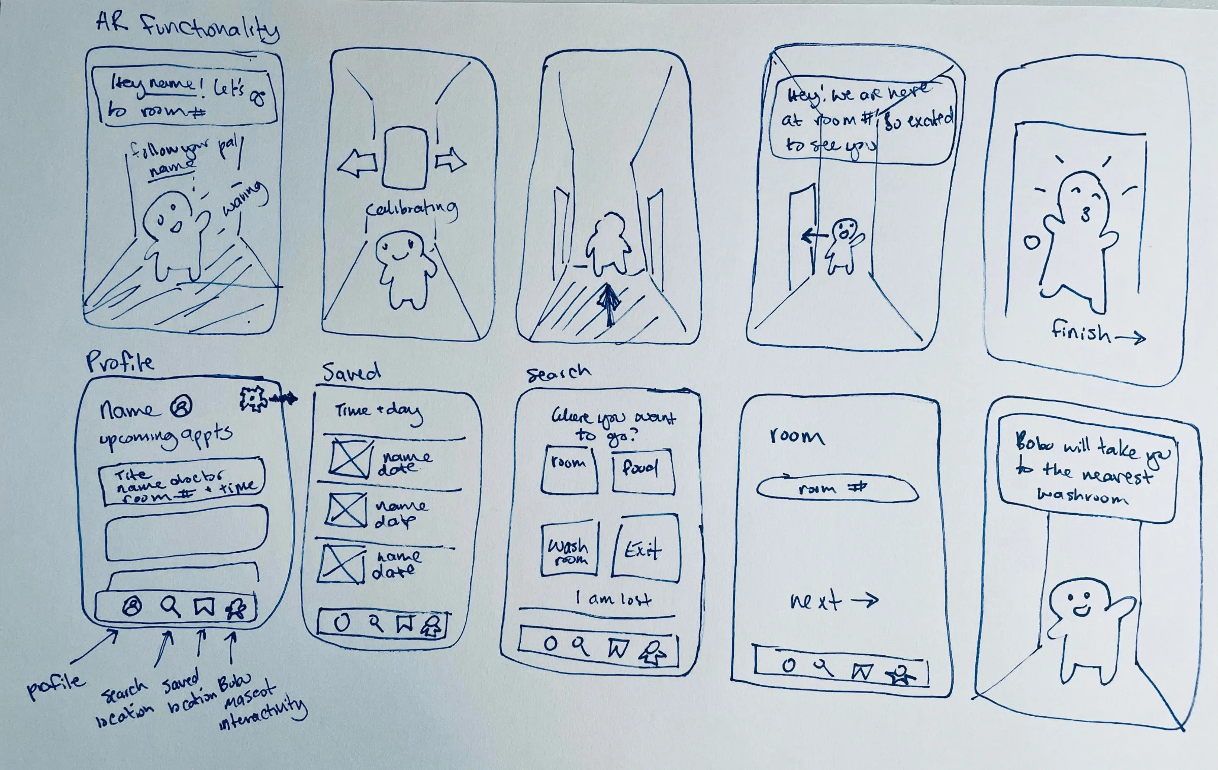
The flow splits in two: a short onboarding where the child names themselves and picks Bobo’s colour, and the AR walk where Bobo waves, leads, and announces arrival. Sketching it on paper made the cuts obvious.
The account step came out early. Email and password were crossed off in the second round with the note that it is stressful enough being in the hospital.

Two rounds, and a shorter way in.
The first round asked for a name, a patient number, an email and a password before anything happened. The second round cut the account entirely, added language choice, made the next button stay grey until a real choice was made, and ended with three AR screens that give one instruction at a time.


Onboarding through to arrival.
Nobody told me children never navigate alone. Two afternoons of sitting still in the building did.
Cutting the account screens was the single biggest improvement between rounds, and it was a subtraction.
A senior designer said this after I presented the project. Observation told me what children did, not why. The next round should add short consented intercept interviews with parents in public areas.